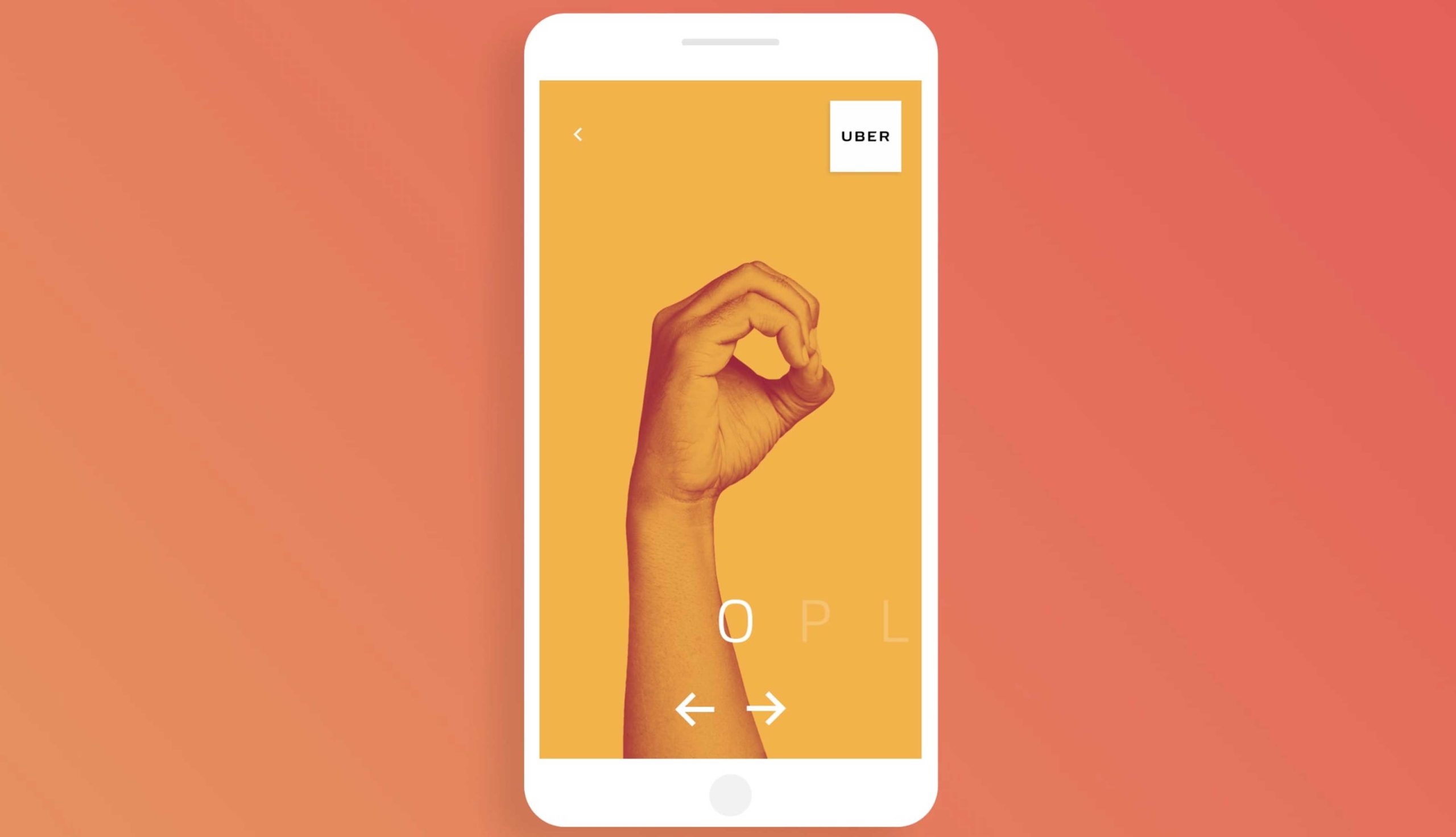
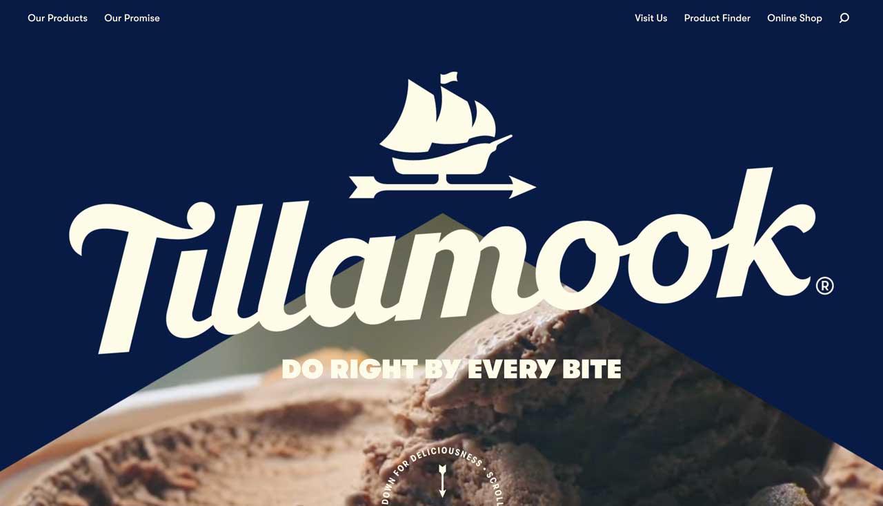
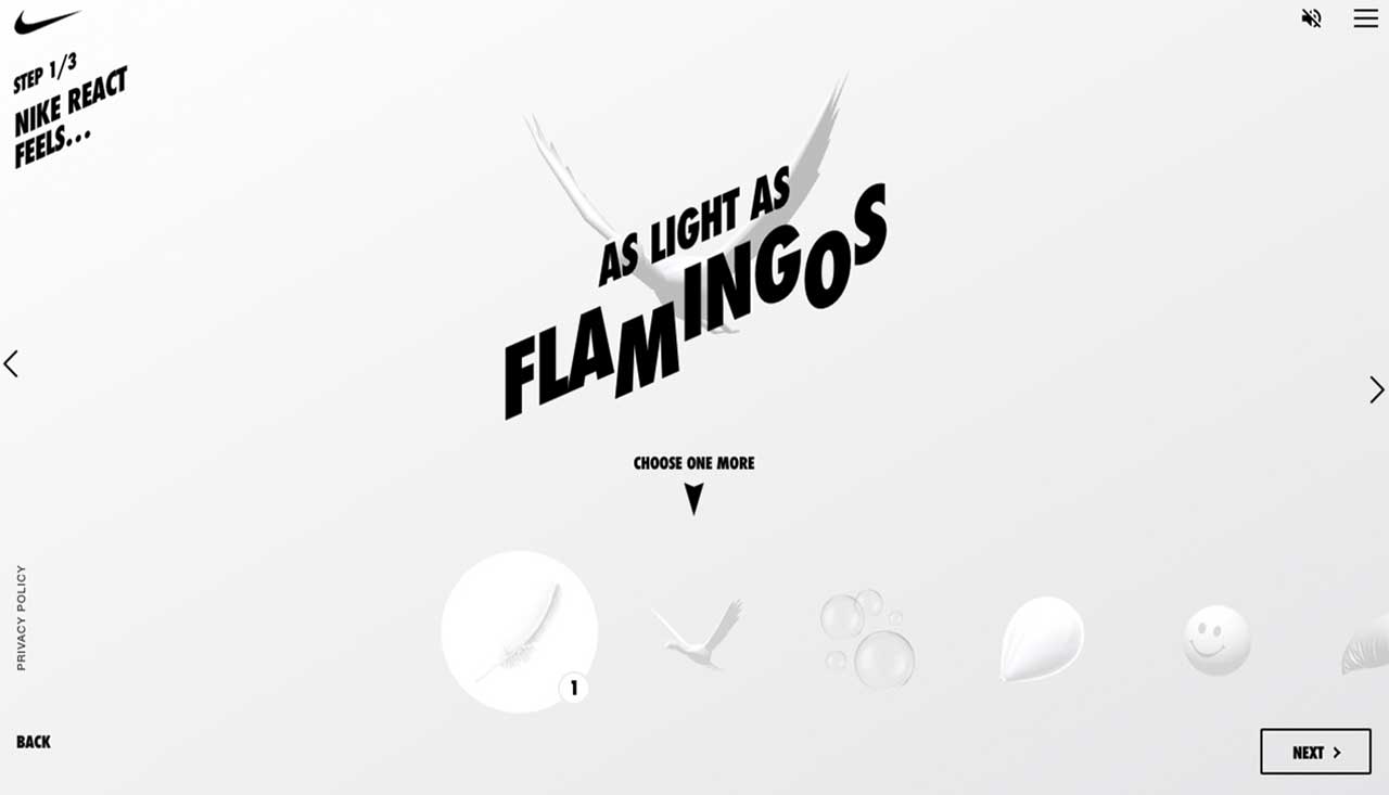
For the last couple of years, we’ve been witnessing a rising trend of interactive links in web design. Large, often kinetic typography that shifts and transforms when clicked or hovered upon can be seen on everything from portfolio websites to online shops. Screen is a fluid medium, and interaction between different design elements on a page is critical to its success in terms of UX and, by extension, brand perception.
Certain interactions, as part of the functional animation, have essentially become a must. It’s important to remember that the web today is inherently interactive in itself.
interactive links are a massive trend and, if done properly and with good measure, they can do wonders for websites across all niches and industries.
— Stockton Koelle
Good UX practices dictate that these interactions should feature some degree of animation in order to let the user know the desired action has indeed taken place. Loading, progress, action complete – these are the animations that not only help liven up a design, but serve a very specific practical purpose.
- Design — is not how the object looks, but how it works.
- Good design — is innovative.
- A good design — is as little design as possible.
- Good design — aesthetic.
These days, there seems to be no shortage of websites with innovative design solutions that stun and delight the visitor. Sometimes the designers take it a bit too far and create overbearing UIs, other times, though, the creation is so interesting and exciting we’re willing to turn a blind eye to some downsides.
Some Examples:
The interaction is well-coded and smooth, without the glitches that sometimes haunt these types of interactive sections.
While all these examples of interactive links in web design bear their unique, idiosyncratic style traits, aligned with the overall aesthetic of the pages they’re nested in, they all have one thing in common – they bring enormous value to the design.


